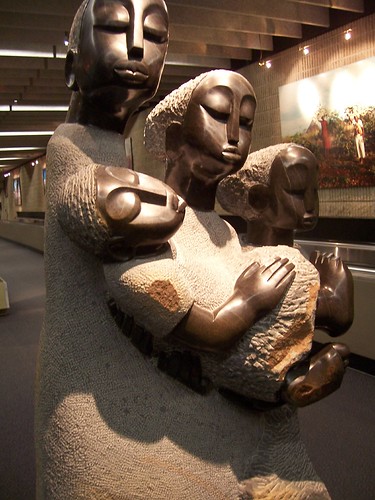
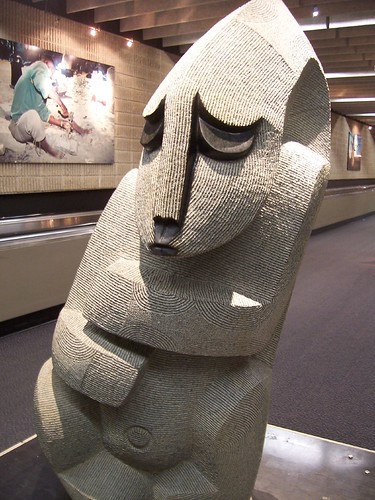
Terminal A at
Reagan National Airport,
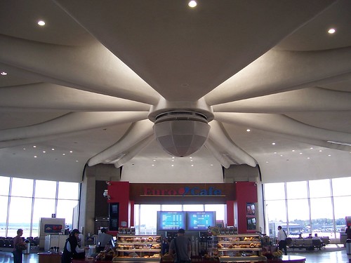
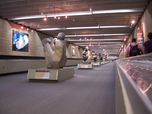
Washington, DC. This terminal was added in 1955 to the original terminal which opened in 1941. Although I could not locate the architect, the design evokes
Eero Saarinen, whose contemporary style can be seen in the terminals at
Washington Dulles and New York's
John F. Kennedy airports.
Unfortunately, modern travel demands rendered this design obsolete years ago. Air travel was a simpler process during the day. Travelers arrived at the terminal and were quickly marshaled onto their planes. Terminal design was sleek and efficient, all in keeping with the speed of the airplanes.
Today travelers are required to check in early and to get through security and hope the plane is on time. Modern airports are designed with comfort services in mind. Since Terminal A was built without any of those considerations, modern services are shoehorned wherever they could fit. So the snack/newspaper stand sticks up in the middle of the terminal like a sore thumb. A restaurant seating area straddles a corridor. A Starbucks is wedged into an angular corner next to the ladies' restroom. The seating area is woefully undersized for today's larger planes. The whole terminal is worn and neglected.
It all adds up to a depressing experience for the traveler, and I'm sure for those that are employed there. There is hope. Renovations have begun on the original 1941 terminal. Whether or not these gates are saved, a modern update will allow fulfillment of a much larger potential.
Technorati Tags: travel, washington, airport, dca

